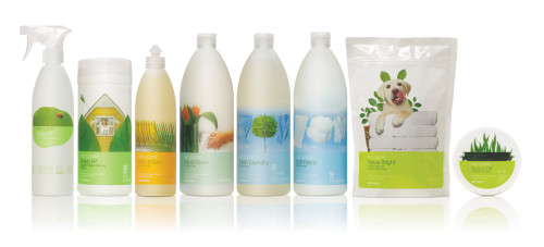
Get Clean
Turner Duckworth, San Francisco, California, 2006
Description
Shaklee, a wellness company, relaunched their line of environmentally friendly cleaning supplies under a new name: Get Clean brings a friendly and natural approach to everyday cleaning by showing home life and natural elements juxtaposed and working together in surprising ways. The leaf-like shape in the logo is reflected in some of the packaging forms, which were carefully selected from stock forms. The packaging system allows consumers to create their own dilutions from the concentrated products, with re-usable bottles and a sticker system. This saves on packaging and transportation waste.
Juror Notes
“Beautifully detailed. Love the interchangeable-label idea and compact sizes—truly green.”
“It looks ‘clean.’ The choice of materials, color, photography creates a very appropriate and effective system.”
“Most notable for its eco-sensitivity, reusable containers, ‘labeling system,’ use of concentrations to dilute to user’s needs. A responsible solution inside and out—simple type, clear declaration of company philosophy.”
Credits
- Design firm
- Turner Duckworth
- Creative directors
- Bruce Duckworth, David Turner
- Designer
- Shawn Rosenberger
- Illustrator
- Danny Smythe
- Photographer
- Danny Smythe
- Client
- Shaklee