Saks Fifth Avenue
Pentagram Design, New York, New York, 2006
Description
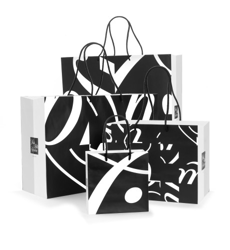
Pentagram designed a new identity for the iconic New York retailer Saks Fifth Avenue that launched in January 2007 and includes signage, advertising, direct mail, online and packaging design. The new identity references a cursive signature utilized in the 1970s that has been redrawn and placed in a black square. The square was subdivided into a grid of 64 smaller squares, which can then be shuffled and rotated to form an almost infinite number of variations. The individual logo tiles can be used in various combinations to form more abstract compositions. Each of these suggests the graphic character of the new logo; enlarged, they have an energy and drama that complements the original mark.
The program, deployed in black and white, creates recognizable consistency without sameness. The logo elements are used in signage, direct mail and advertising. There are over 40 different packages, from jewelry boxes to hatboxes, and four sizes of shopping bags. No two of these are alike, yet they all go together. They will all eventually become associated in the minds of shoppers with the style and élan of Saks Fifth Avenue.
Juror Notes
“Takes old, established brand and makes it contemporary.”
Credits
- Design firm
- Pentagram Design
- Art director
- Michael Bierut
- Designers
- Jennifer Kinon, Kerrie Powell
- Typeface
- Joe Finocchiaro Design
- Manufacturer
- Finlay Printing
- Client
- Saks Fifth Avenue


