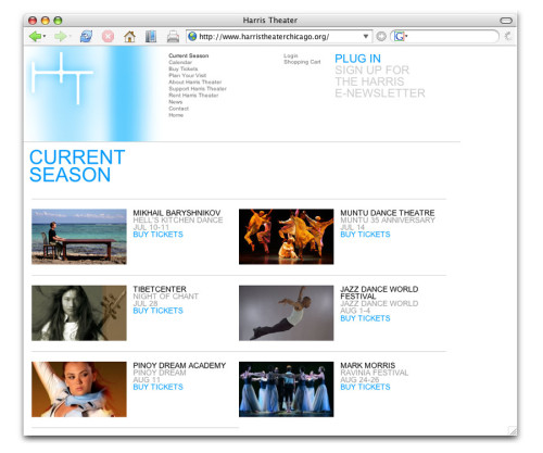
Harris Theater (http://www.harristheaterchicago.org/)
Studio Blue, Chicago, Illinois, 2006
Description
The Harris Theater is a performing-arts venue that provides its stage and facilities for companies that do not have the means or performance space to reach a larger audience. Because the theater does not specialize in any one type of performance, each season is incredibly diverse, ranging from opera to ballet and contemporary dance, to symphonic and ethnic music productions, to children’s programming. This cornerstone of the theater brand was brought right to the fore on the website. Choosing not to highlight one featured performance on the homepage as other theaters do, we developed an animated image library that theater staff can edit themselves as new companies are added throughout the season. This treatment allows all companies to share top billing.
The visual vocabulary of the website draws from the physical experience of the theater. Extending below ground, each level of the theater is architecturally minimal, yet vividly illuminated by rows of exposed fluorescent tubes covered with colored gels. We elaborated on this signature visual element in the homepage animation and theater brand, bringing an “electric” quality to the site.
Juror Notes
“Simple. It works—feels like the performing arts. The style is the programming.”
Credits
- Design firm
- Studio Blue
- Creative director
- Garrett Niksch
- Designers
- Garrett Niksch, Cheryl Towler Weese
- Production coordinator
- Erin Bauman
- Interactive designers
- Palantir.net, Mathematic Arts (Flash components)
- Project managers
- Kathy Fredrickson, Maggie Lewis
- Client
- Harris Theater


