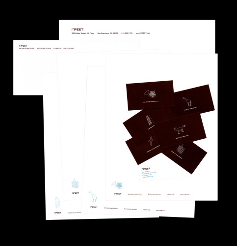
17FEET, Stationery system
17FEET, San Francisco, California, 2007
Description
Frequently asked what the name 17FEET meant, the studio set out to design a stationery system that would preempt the question while not really answering it at all. Each employee was tasked to find real things that were 17 feet in height, length, width or otherwise. From body parts to famous architecture, each card is unique and quirky, reflecting a little bit about the person whose name is on the card. It’s an ever-growing list, so as company expands, so will the catalog of all things 17FEET.
Collections:
AIGA 365: 29 (2008)
Repository:
Denver Art Museum
Discipline:
Brand and identity systems design
Format:
Stationery
Credits
- Design firm
- 17FEET
- Creative director
- Brandon Herring
- Art director
- Lisi Howell
- Illustrator
- Lisi Howell
- Typeface
- Arial Rounded MT Bold
- Client
- 17FEET
Loading...
Loading...


