El Capitán
Sara Schneider, 2000
Description
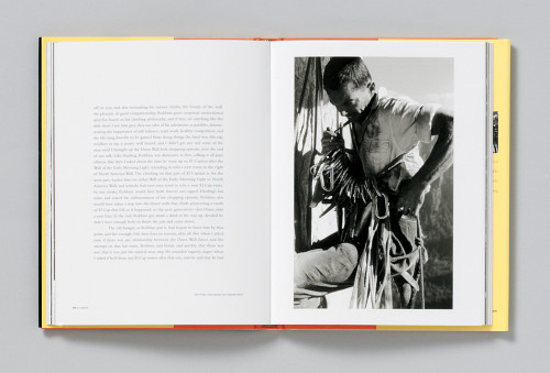
The main challenge with El Capitán was to create a vertical experience without the advantage of four-color images that would have enhanced the grandness of the mountain. The solution was found through the simple pacing of the images as single-page and two-page spreads in an attempt to describe the scale of all that surrounded the climbers. The detailing of the first two lines of text at the beginning of each chapter also serves to suggest the jagged terrain that the climbers would encounter. The photograph on the cover was selected because it basically tells El Capitán’s emotional story, and the placement of the type on the cover below the climber implies that the climber is moving up. I am happy with the simplicity of the design as it allows the text and the images to create the drama for the reader. The design does not compete with the storytelling.
Credits
- Art director
- Sara Schneider
- Designer
- Meryl Pollen
- Photographers
- Ed Cooper, Tom Frost, Greg Epperson, Corey Rich, Eric Perlman
- Production coordinator
- Steve Kim
- Trim size
- 7 1/2 x 9 3/4
- Pages
- 144
- Quantity printed
- 10,000
- Compositor
- Meryl Pollen
- Typefaces
- Franklin Gothic, Bembo
- Printer/binder
- Dai Nippon Printing Co.
- Paper
- 157 gsm matte-coated paper
- Binding method
- Smythe-sewn, case-bound, square back
- Author
- Daniel Duane
- Publisher
- Chronicle Books


