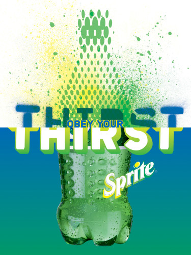
Sprite posters and Times Square billboard
Ogilvy & Mather, New York, New York, 2003
Description
The Coca-Cola Company asked the Brand Integration Group (BIG) at Ogilvy & Mather to create a new global branding and communication program for Sprite. Traditionally, bottlers and distributors had produced their own design programs, which resulted in a range of disconnected strategies and executions. Sprite wanted a broadly defined but integrated approach. They also wanted the creative work to be adaptable market by market. The aim was to reconnect Sprite to young people around the world.
Rather than mimicking the hyper-stylized photographic cues of the category, BIG resolved to find a unique visual strategy for Sprite. Working closely with the client, they undertook a global design audit that focused on emerging youth culture. After discovering that the dimpled green Sprite bottle was recognizable around the world, BIG adopted a mix-and-match framework. The bottom half of every poster features the same iconic green dimpled bottle, but the top half changes to reflect the myriad ways of expressing “thirst.”
BIG’s solution offers both constancy and endless variation. It is a flexible system that allows local markets to customize posters for their audiences—local artists, graffiti writers, illustrators, and regional designers can all bring the brand to life in their own way. Sprite can change and evolve appropriately, and the brand message is never compromised. The influences of Japanese pop art and global street culture are all discernible, as is the fusion of complex computer illustration, painting, and low-tech graphics. Each poster amplifies the visual equities of the brand, in particular the refreshing lemon-lime essence of Sprite. The poster launched on Coca-Cola’s giant billboard in Times Square.
Juror Notes
Very impressed and surprised by the quality of the design, specially for this client.
Credits
- Design firm
- Ogilvy & Mather
- Creative director
- Brian Collins
- Art director
- Weston Bingham
- Designers
- Maja Blazejewska, Satian Pengsathapon, Jason Ring, Iwona Waluk
- Illustrators
- Maja Blazejewska, Iwona Waluk
- Client
- The Coca-Cola Company


