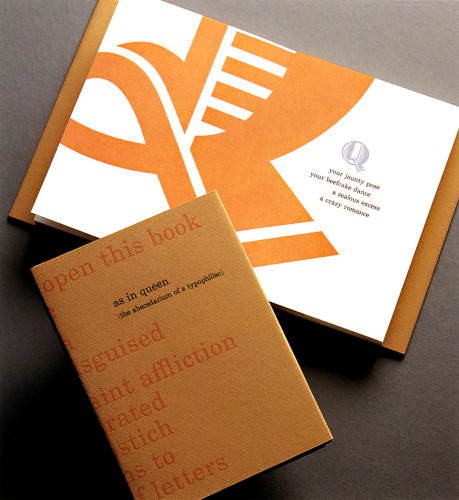
As in Queen (The ABCedarium of a Typophiliac)
Palabra Press, Ithaca, New York, 1997
Description
The book is an alphabet book of the letter Q. The text is a series of praise poems to this letter. The words form mesostichs (similar to acrostics) in which a word is created by the vertical alignment of horizontal lines, in the middle of the text block. The words thus formed are the name of the typeface of the particular Q, in alphabetical order.
I enjoyed the enviable situation of being both writer and designer (and printer and binder and publisher). I (we?) sought to make the writing and physicality of the work wholly entwined. This is my ideal as a book artist. I tried to keep the cost of materials down, which prompted me to use this intimate page size. The essence of the letters can’t be contained on any page, however large. The cropped emphasis on parts of letters dovetails with the fetishism of the words to embody the obsessive gaze of the typophiliac. The whole is text.
Credits
- Design firm
- Palabra Press
- Art director/designer
- Leda Black
- Author
- Leda Black
- Typeface
- Various
- Printer/binder
- Leda Black (Letterpress, Hand Bound)
- Paper
- Somerset Satin 250 gsm, Fabriano Ingres Cover, Hahnemühle Ingres
- Publisher/client
- Palabra Press