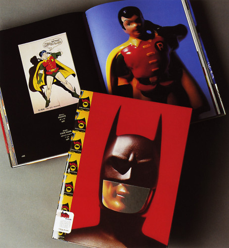
Batman Collected
Chip Kidd, 1996
Description
As a book designer by trade, when it came to deciding what my own book would look like, I was faced with a situation I saw as the visual equivalent of choosing a name for your first-born child. It was the sort of dilemma I imagined architects face when designing their own houses, when four-star chefs make dinner for themselves, when prostitutes masturbate—you get the idea. When we in the creative services industry have to service ourselves, it can be terrifying.
I divided myself into two people—author and designer. The author me went on hiatus, to return when the visuals were in place. The designer me decided to approach it the way I approach everything else: I started with the content and let that determine its appearance, how it would be photographed and placed on the page. I wanted the audience to view these objects the way I did as a child. Thus, they loom large and imposing, offering a mixture of comfort and menace, the promise of salvation via gleeful catastrophe. I would not allow for margins—the only boundaries would be where the pages ended and the imagination took over.
When the author me was permitted to return, I found that most of the storytelling work was done. I wrote a minimal text. This is a book in which (as New York magazine observed) the images are the words. It’s not so much a book in the traditional sense as it is a magnifying glass and time machine combined.
Credits
- Art director/designer
- Chip Kidd
- Photographer
- Geoff Spear
- Author
- Chip Kidd
- Typeface
- Bodoni Oldface
- Printer
- Imago
- Paper
- 170 gsm Nymolla Art Stock
- Publisher
- Bulfinch Press