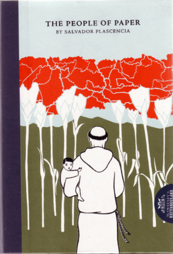
The People of Paper
McSweeney’s Publishing, San Francisco, California, 2005
Description
The book is concerned with the limits of fiction. The basic history is full of lies, but details that seem ridiculous turn out to be entirely true. The challenge of this book was to find a cover that echoed that. We didn’t want anything too realist or literal—nothing that would demystify the book. But we also wanted to preserve the seriousness and resonance of the story, so the cover couldn’t be too goofy. Finally, we wanted to reflect the lush geography of the book’s setting. Rachell Sumpter had just the right style for all this, and we worked together to find an image that would gently capture the restrained surreality within.
Juror Notes
Beautifully illustrated case and inventive typesetting within (type runs in multiple columns with the occasional blotted-out sections). Yet it still works and reads as a novel.
I am continually impressed with McSweeney’s approach to the design of its books. In the highly competitive world of literary fiction, they have, by design, made a place for themselves. The production isn’t lavish, but there is always a visual element that gives you pause—enough to want to pick up the book. Once in your hands, they’re hard to put down. It is this acknowledgment of the tactile that is their strength. The die-cut covers, or three-piece binding, the wrapped bands, there’s a sense of play—and in this book’s text, a sense of mischief in the blocked-out paragraphs or inverted type. It feels familiar—but wait, you’ve been tricked.
Credits
- Design firm
- McSweeney’s Publishing
- Creative director
- Eli Horowitz
- Illustrator
- Rachell Sumpter
- Author
- Salvador Plascencia
- Editor
- Eli Horowitz
- Trim size
- 6.5 x 9.25 inches
- Pages
- 244
- Quantity printed
- 10,000
- Typeface
- Garamond 3
- Printer/binder
- Tien Wah Press
- Paper
- 130 gsm Nymolla Woodfree
- Binding method
- Hardcover, sewn
- Publisher/client
- McSweeney’s