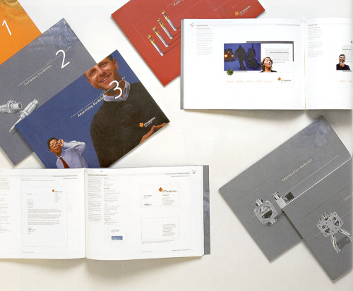
ITT Industries Identity Manual
Landor Associates, San Francisco, California, 1998
Description
Just as ITT Industries prides itself on building exceptional products that are “Engineered for Life,” the brand and all its various applications need to be treated with the same regard. Every element—the format, typography, materials, photography, and illustration—used in the manual contributes to the look and feel of ITT Industries, and helps communicates the precision, strength, engineering, and unity of the brand.
Given the overall length of the manual, it was decided early in the design process that each section of the manual should be able to stand alone as a separate book for ease of use. This approach posed a particular challenge in providing a final product with unique parts that always felt unified as a whole. We also tried not to make a dry and instructional identity standards manual, instead creating a document that we hope provides both content and inspiration to all who use it.
Credits
- Design firm
- Landor Associates
- Creative director
- Margaret Youngblood
- Art director/designer
- Jamie Calderon
- Photographer
- David Magnusson
- Writers
- Bruce McGovert, Laura Pickering, Susan Manning
- Typefaces
- Humanist 777, Classical Garamond
- Printer
- Paragraphics/Jeff Towner; Colormatch/Willie Herzig
- Paper
- Fox River Starwhite Vicksburg
- Client
- ITT Industries