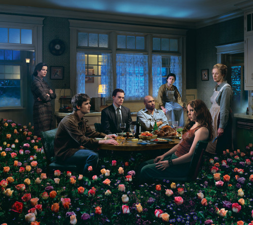
Six Feet Under: Better Living Through Death
Design: MW, New York, New York, 2003
Description
The design problem was to make a television tie-in book reflecting the depth and sophistication of the show, instead of the usual behind-the-scenes/celebrity TV book.
The subtext of the show is the tension between what is above the surface versus what is below the surface, and the form of the book reflects this. The book rises upward out of its stiff slipcase box, revealing the characters underneath the large opaque solid on the slipcase. The binding is left unfinished, the structure of the spine sewing revealed in red thread.
The interior of the book is a collection of artifacts, from which the reader can glean a wealth of information to gain deeper insight into the storyline and characters of the show. Most artifacts are actual objects we created and photographed, and some artifact information is made into a layout that refers to the language of that type of document. Interspersed with photographic stills of the sets and pure text pages, the pages form a cinematic continuum. The book is organized chronologically, with each new section delineated by pure white spreads with a quote about death (mimicking the way the show fades to white between scenes).
Our goal was to create a book that reflects the complexity and creativity of the show, one that the creators of the show would be truly proud of. Since it has been well received both critically and commercially, we hope that it has raised the bar for television tie-in books.
Juror Notes
“Although I am not a fan of the HBO show, this reflects its tone perfectly. It’s very interesting to see how well the book can connect to the television show and even extend the understanding of the show. Innovative package and design.” Isabel Warren-Lynch
“It is macabre in a good way. Expands on the characters. Getting it out of the box was difficult.” Archie Ferguson
Credits
- Design firm
- Design: MW
- Creative director
- Melcher Media
- Art directors
- Allison Williams, J.P. Williams
- Designer
- Yael Eisele
- Jacket designer
- Yael Eisele
- Photographers
- John Johnson, Will Norton, Grant Peterson, Larry Watson
- Production director
- Andrea Hirsh
- Production artist
- Yael Eisele
- Picture editor
- Melcher Media
- Authors
- Alan Ball, Alan Poul
- Editors
- Duncan Bock, Lia Ronnen
- Publisher
- Pocket Books
- Trim size
- 6 3/8 x 9 1/2”
- Pages
- 208
- Quantity printed
- 50,000
- Typefaces
- AG Book Rounded, Ambroise, American Typewriter, AT Engravure, AT Sackers Gothic, Bauer Bodoni, Berthold Script, Bodoni, DIN Family, Engravers Gothic, Eric Sans Regular, Fat Face, Filosofia, Fleetwood, Futura, Gill Sans, Helvetica Neue, Interstate, Joanna TT, Kuenstler Script, Letter Gothic, Luna Gothic, Officina Sans, Officina Serif, Times New Roman, Vendetta, Young Baroque, Zapf Dingbats
- Printer
- Phoenix Color Corp.
- Binder
- Phoenix Color Corp.
- Binding method
- Exposed Smyth sewn
- Book type
- Image driven


