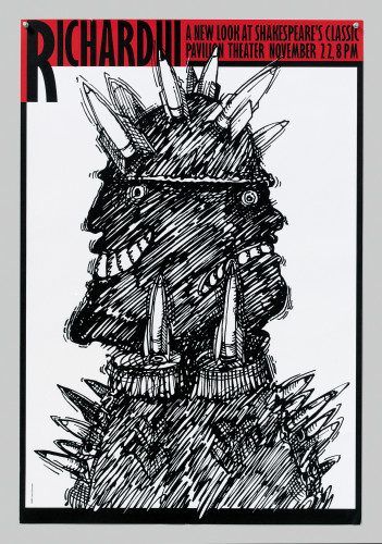
Richard III poster
Sommese Design, State College, Pennsylvania, 2000
Description
The problem was to create a poster for an updated version of the Shakespeare classic Richard III that would appeal to the population of the Penn State University community. I created the graphic to suggest the production’s modernized interpretation of the Shakespeare play. The ironic juxtaposition of the classic’s title with the imagery of modern weapons of mass destruction proved to be very effective at appealing to an academic audience that was, for the most part, well aware of the original time frame of the play. Rather than flooding the campus with cheaply printed flyer, we chose to produce a limited number of large posters using one of the large format computer plotters available to us on campus. These were strategically positioned in order to reach the largest number of people.
Credits
- Design firm
- Sommese Design
- Art director/creative director
- Lanny Sommese
- Designer/illustrator
- Lanny Sommese
- Digital production
- Matt Flick
- Typeface
- Gill Sans
- Software
- Adobe Illustrator, Adobe Streamline
- Trim size
- 24 x 34 inches
- Printer
- Penn State University
- Client
- Penn State University