Simple Times
Grand Central Publishing, New York, New York, 2010
Description
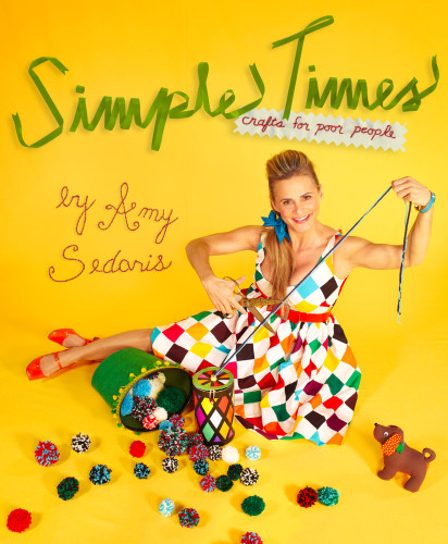
Project brief: “In addition to being eye-catching, a book cover ideally reflects what you find inside, and in the case of Simple Times, that would mean organized chaos. The book jacket was created in the same collaborative style as the book. Adam Selman designed my dress so it would pop against the golden yellow backdrop. Conn Brattain created the title using green ribbon he had lying around. Vicki Farrell wrote my name using string and Megan Whitmarsh embroidered the subtitle. The idea was to use real objects to fashion in a way that emphasized simplicity. Some might say my tendency toward the simple is born out of laziness, but the truth is, although I like things easy, I just like the way simple feels.” —Amy Sedaris
Approach: “In addition to being eye-catching, a book cover ideally reflects what you find inside, and in the case of Simple Times, that would mean organized chaos. The book jacket was created in the same collaborative style as the book. Adam Selman designed my dress so it would pop against the golden yellow backdrop. Conn Brattain created the title using green ribbon he had lying around. Vicki Farrell wrote my name using string and Megan Whitmarsh embroidered the subtitle. The idea was to use real objects to fashion in a way that emphasized simplicity. Some might say my tendency toward the simple is born out of laziness, but the truth is, although I like things easy, I just like the way simple feels.” —Amy Sedaris
Effectiveness: “In addition to being eye-catching, a book cover ideally reflects what you find inside, and in the case of Simple Times, that would mean organized chaos. The book jacket was created in the same collaborative style as the book. Adam Selman designed my dress so it would pop against the golden yellow backdrop. Conn Brattain created the title using green ribbon he had lying around. Vicki Farrell wrote my name using string and Megan Whitmarsh embroidered the subtitle. The idea was to use real objects to fashion in a way that emphasized simplicity. Some might say my tendency toward the simple is born out of laziness, but the truth is, although I like things easy, I just like the way simple feels.” —Amy Sedaris
Juror Notes
A wonderfully crafty solution to a book on crafts. The embroidered type and illustrations throughout are perfectly integrated.
Credits
- Design firm
- Grand Central Publishing
- Creative director
- Anne Twomey
- Art director
- Adam Selman
- Designer
- Conn Brattain
- Photographer
- Jason Rothenberg


