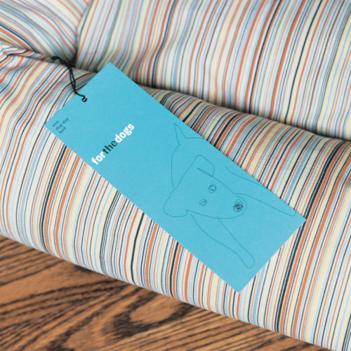
For the Dogs Logo
Concrete Design Communications, Inc., Toronto, Ontario, 2003
Description
People spend money on their kids and their dogs. There is a proliferation in North America of products aimed at dog owners, such as beds, collars, tags, and so on. However, the market seems to lack products that appeal to those who are fashion conscious or have a more modern design aesthetic. The owner of a Charles Eames lounge or a pair of Costume National shoes would probably not be satisfied with most pet store offerings. This is the market that For the Dogs is trying to capture.
Our mandate was to produce a graphic visual identity that could be applied to various applications (hang tags, labels, packaging etc.). Moreover, developing a series of distinctive textile patterns applied to the core of the product line (beds and bags) would allow us to brand the product where the visual identity was not prominently displayed.
The approach to the visual identity was quite simple: an illustration of a dog. However, the execution of that image had to capture the aesthetic of the brand. We considered hundreds of different drawings of various breeds. We instantly recognized the final version when we saw it. The dog (of questionable pedigree) was amusing, vulnerable, cute, and undeniably urban.
Within a year of the new brand launch, revenues of For the Dogs products doubled. The products have received exposure in several major publications and sales have expanded to Europe and Japan.
Juror Notes
Loved the simplicity but wanted to see how the logo was applied to collateral applications.
Credits
- Design firm
- Concrete Design Communications, Inc.
- Art directors
- Diti Katona, John Pylypczak
- Designers
- Claire Dawson, John Pylypczak
- Illustrator
- Melissa Agostino
- Project manager
- Lou Ann Sartori
- Typeface
- Knockout
- Client
- For the Dogs, Inc.


