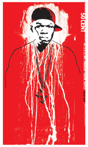
50 Cent poster
Modern Dog, Seattle, Washington, 2003
Description
I overcame two hurdles with this poster—a tiny budget and low quantity. I used just two colors, keeping the total cost to $273. And with the low quantity, screen printing was not only the most practical but our preferred reproduction method.
The audience for the 50 Cent poster was not only his fans, but the general public. The poster could so easily glorify the violent, misogynistic world of rap, but I didn’t want that to be the end message.
I created a high-contrast image of 50 Cent and superimposed it over dripping paint. The color scheme of black and white with a red background is minimal and powerful—even suggesting blood. This collage, with his very intense expression, clearly gives off an urban street toughness, an important element to the fans of his music.
But because the image is most detailed on 50 Cent’s head and face and his body is only suggested, the final image looks as though the focus is on his thoughts and mind rather than his physical presence. And the fine art quality of the collage suggests an examination of the person over a glorification of what he represents.
What makes this poster work is the immediate emotional reaction it evokes in the viewer. Although it didn’t create a quantifiable economic impact—since the show had already sold out—it does aim to have a long-term effect in creating public awareness of 50 Cent as a person, not a stereotype.
Juror Notes
The rawness is perfect and it is ironic that he is white.
Credits
- Design firm
- Modern Dog
- Art director
- Michael Strassburger
- Designer
- Michael Strassburger
- Illustrator
- Michael Strassburger
- Production artist
- Michael Strassburger
- Printer
- Clone Press
- Printing method
- Screen print
- Paper
- Cougar Opaque White 80 lb. cover
- Typeface
- Conduit
- Client
- House of Blues