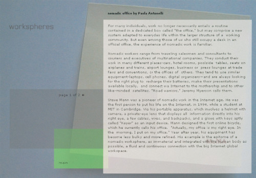
Workspheres website and kiosk
Method, Inc., New York, New York, 2000
Description
The primary challenge was to showcase more than 150 products on one screen, while continuing to develop and enhance the visual language of the “Workspheres” exhibition. We wanted to develop a not so abstract metaphor for the workplace that could visually relate the web site to the exhibition. The post-it note—one of the most common elements of the workplace—became this icon. On a technical level, we developed a sorting mechanism to help navigate the user through the massive amount of content, which is accessible on just one page. We feel that the site successfully integrates and continues the design language of both the exhibition and the other marketing collateral. We were able to develop not only a website but also a kiosk that served as a guide within the exhibition.
Credits
- Design firm
- Method, Inc.
- Creative director/lead designer
- Olivier Chételat
- Designers
- Alicia Cheng, Thomas Noller
- Interaction designers
- April Starr, Ted Booth
- Content strategist
- Chris Torrens
- Site engineering
- Jonathan Synder
- Producer
- Natalia Maric
- Account manager
- Monte Bartlett
- Typeface
- Verdana
- Software
- Adobe Illustrator, Adobe PhotoShop, Flash
- Client
- Museum of Modern Art


