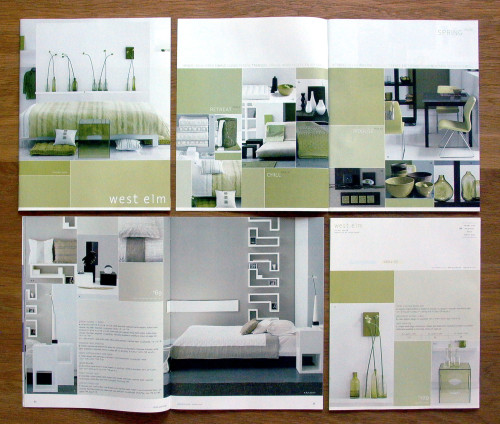
West Elm Brand Development
Design: MW, New York, New York, 2003
Description
West Elm is a new brand of inexpensive home furnishings, aimed at an urban, design savvy audience. Implicit in building the identity of the brand was the core belief that low cost can be high style, and that there is an American mass-market audience for sophisticated, understated, chic home furnishings at a low price point. West Elm is built upon the confidence that if you provide it, the audience will get it.
The brand image of West Elm was developed primarily through the direct-mail catalog that preceded the ecommerce site.
First, we identified the common design weaknesses of competitors catalogs: they were either disorganized and chaotic, or were overly rigid and sterile. Instead of the usual catalog method of shooting photos to fit into a sketched layout, we devised a catalog format that could accommodate a wide range of differing shapes. During the photo shoot, the photographer has the ability to compose images that best fit the merchandise. This allows for a wide range of diversity in page layouts, maintaining a syncopated sense of order. Colored bars are used to fill out the pages and add price pops. This color blocking reinforces the whole-room, color-coordinated merchandising strategy of West Elm. Most inexpensive “designer/architect” brands sell their wares as items, with little guidance as to how to put them together.
Much of our energy and efforts went into developing a signature language of photography through art direction, prop styling, and set design. The room sets are clean, yet visually complex: the rooms make reference to architectural settings rather than evoking actual residences. Minimal—yet quirky—prop styling adds personality to create a signature West Elm look. Within each photo the merchandise and walls are always parallel or at a right angle to the edge of the frame, giving the pages a uniformity and calmness within all the complexity and product density. Large expanses of wall are left bare, a place for the eye to rest.
The brand has been exceptionally well received, consistently beating the planned projections. They are currently opening stores nationwide.
I do not have exact budget information, but the budget for design, writing, photography, production, and so on is certainly at least $2 million per year.
Juror Notes
They carry the quality through all of the collateral.
Credits
- Design firm
- Design: MW
- Creative director
- Allison Williams
- Art director
- Allison Williams
- Designers
- Abby Clawson, David Correll, Yael Eisele, Allison Williams
- Photographer
- James Merrel
- Printers
- AGW/Titian, RR Donnelley
- Printing method
- Web offset, offset
- Binding method
- Saddle wire
- Typefaces
- Akzidenz Grotesk, Bell Gothic, Interstate
- Client
- West Elm


