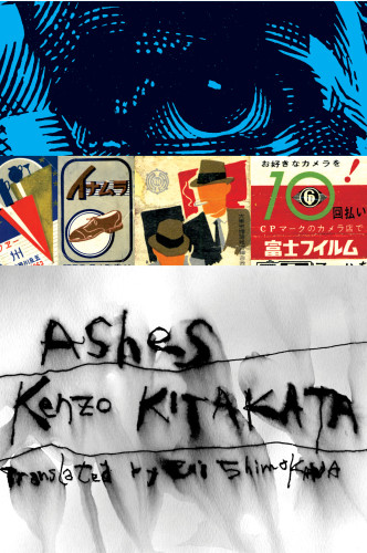
Ashes
Chip Kidd Design, New York, New York, 2003
Description
Ashes presented an extraordinary opportunity for me to basically wallow in my love of Japanese ephemera and sensibility, both new and old. The book tells a related group of stories about an aging don of the Yakuza (the Japanese Mafia). He spends a lot of time pondering life in bars (before shooting them up in a drunken rage), so I exploited this chance to use my collection of Japanese matchbooks from the 50s and 60s. The design is literally as layered as the stories, and the publisher was gracious enough to allow for not one but two jackets, at different levels, which is common in contemporary Japanese commercial book design. The outer layer is meant to mimic a napkin, which may or may not have been cried on, but certainly spilt on. That’s peeled back to reveal the matchbooks, which are as varied and colorful as the napkin is not, and that gives way to a detail of the main character, trying to rise above it all. Whether he does or not depends on the reader.
Juror Notes
“A layering of surfaces that lures the reader into the book.” Jack Woody
“This takes covers in a new direction. We are being taught to see differently.” Archie Ferguson
Credits
- Design firm
- Chip Kidd Design
- Creative director
- Chip Kidd
- Art director
- Chip Kidd
- Jacket designer
- Chip Kidd
- Production director
- Kenji Ishimaru
- Production coordinator
- Kenji Ishimaru
- Author
- Kenzo Kitakata
- Editor
- Yani Mentzas
- Publisher
- Vertical Inc.
- Trim size
- 5.75 x 8.75”
- Quantity printed
- 6,000
- Typeface
- Hand lettering
- Jacket printer
- Coral Graphics
- Papers
- Tomahawk matte coated 20 lb., gloss coated 30 lb., textured uncoated 40 lb.
- Book type
- Literature and nonfiction