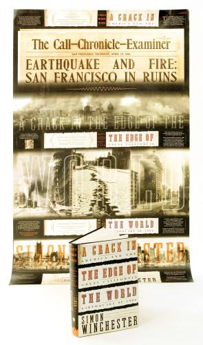
A Crack in the Edge of the World
Roberto de Vicq, New York, New York, 2005
Description
A Crack in the Edge of the World explores the geological underpinnings of the San Francisco earthquake of 1906 and its effect on 20th-century American history. The book was the first with American subject matter for this well-known British author, and the publisher wanted to make it a very special package.
Using the paper as a metaphor for terra firma, the jacket unfolds (six times), revealing scenes of horror and destruction. It was a very complicated package to research and execute. We needed a paper that didn’t bulk when it was folded, was resistant when opened, and had memory to go back and wrap around itself around the cover. When completely unfolded, it also served as a promotional poster for the booksellers.
Juror Notes
Just when you think you’ve seen the jacket-fold-out-into-a-poster idea one too many times, along comes this tour de force of commercial cover design.
A successful visual play on reading between the lines—or, in this case—between the cracks.
Credits
- Design firm
- Roberto de Vicq
- Art director/creative director/designer
- Roberto de Vicq de Cumptich
- Photographer
- All historical photographs from different archives
- Production director
- Roni Axelrod
- Production coordinator
- Roni Axelrod
- Picture editor
- Laura Wyss
- Author
- Simon Winchester
- Editor
- Henry Ferris
- Trim size
- 6 x 9 jacket (folded size), 28 x 36 (unfolded)
- Pages
- 480
- Quantity printed
- 140,000
- Typefaces
- Grand Canyon, Splendid Quartet, Cheltenham
- Jacket printer
- Phoenix Color
- Paper
- 60 lb. offset, cream white
- Publisher/client
- HarperCollins