Nickelodeon Fish Identity
Nickelodeon On-Air Design, New York, New York, 1996
Description
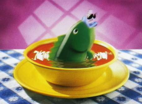
The parameters of the assignment were to create a five-second I.D. that contained the Nickelodeon logo for three of the five seconds. Station I.D.’s as short as five seconds are usually executed with pure image and design. My goal was to incorporate a humorous storyline within the quick timeframe.
I love the spot’s simplicity. The composition is clean, with bold graphic colors, and the narrative is quick and unexpected. Both design and narrative work to reflect the wacky fun side of Nickelodeon.
Collections:
Communication Graphics: 18 (1997)
Repository:
Denver Art Museum
Discipline:
Motion graphics
Format:
Animation, Motion graphic
Credits
- Design firm
- Nickelodeon On-Air Design
- Art director
- Linda Walsh
- Graphic designer
- Linda Walsh
- Animator
- Douglass Grimmett (Primal Screen)
- Sound editor
- Clack
- Client
- Nickelodeon
Loading...
Loading...


