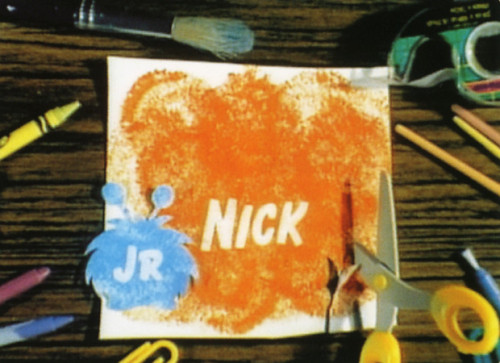
Nick Jr. “Monsters” ID
MTV Networks, New York, New York, 1997
Description
The creative strategy was to create a station ID supporting Nick Jr.’s brand message, which reflects and encourages the nurturing relationships between a caregiver and a child. The big monster in the spot represents the parental figure and demonstrates a playful, nurturing relationship with the child-size monster. The design parameters consisted of using organic materials familiar to a preschooler. The spot’s narrative and graphic style communicate Nick Jr.’s image to an audience of preschoolers aged two to five, and their caregivers. The result is a spot that is both entertaining and effective as a station ID.
Collections:
Communication Graphics: 19 (1998)
Discipline:
Brand and identity systems design
Format:
Animation, Motion graphic, Promotion
Credits
- Design firm
- MTV Networks
- Creative directors
- George Guzman, Agi Fodor, Linda Walsh
- Animator
- Funline Animations
- Writer
- Anastasia Kedroe
- Digital video producer
- Anastasia Kedroe
- Client
- Nickelodeon On-Air
Loading...
Loading...


