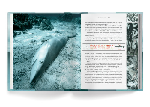
Oceana: Our Endangered Oceans and What We Can Do to Save Them
Headcase Design, Emmaus, Pennsylvania, 2010
Description
Project brief: Rodale approached us to design actor and ocean activist Ted Danson’s book Oceana, which describes the impending crisis affecting our oceans and offers solutions as to how we can avert them by providing specific courses of action you can take to help. They were looking for a very visual and beautiful take on the subject that would be part activist/current affairs book and part coffee-table photo book. They wanted to reach an audience that may not normally purchase an activist book and give a sense of hope without glossing over or diffusing the gravity of the situation.
The book was on a breakneck schedule to meet publicity dates, and the bulk of the work had to be completed in little more than five weeks, including most information graphics and photo research!
Approach: Our concept for the cover was to show an understated image of the ocean that would feel meaningful and was both somber and beautiful. The spine hints at the information graphics contained inside by showing how much our oceans have risen over the years, and how much more they may rise in the future. For the interior, we wanted to have important facts jump out at the reader as they flip through the book so they can quickly take away information or find a point of interest to investigate. We put small factoid graphics in the margins of the spreads, and the pull quotes also highlight important points. The chapter openers depict the various problems our oceans face, but they imply hope for the future by having the early chapters bathed in grim gray colors, eventually turning to an optimistic blue by the last chapter.
Of course, given the topic, it was crucial that the book be printed on recycled acid-free paper, and it needed to be printed domestically given the tight turnaround time.
Effectiveness: Both Rodale and Ted Danson were extremely happy with how the book turned out (as were we) because it takes a potentially ugly subject matter (oil spills, pollution, acidification, bycatch, etc.) and presents it in a visually appealing way without sugarcoating it. Not to mention that it is a complex and intricate design that came together with such an extreme time constraint.
Juror Notes
Beautifully executed book about the crisis of our oceans. The wonderful colors and well-finessed graphic details make this an engaging read. Lovely attention to detail and well-employed use of the grid.
Credits
- Design firm
- Headcase Design
- Creative director
- Amy King
- Art director
- Paul Kepple
- Designers
- Raphael Geroni, Paul Kepple, Susan Van Horn
- Illustrators
- Don Foley, Headcase Design
- Picture editor
- Susan Oyama
- Authors
- Michael D’Orso, Ted Danson
- Editor
- Colin Dickerman
- Client
- Rodale


