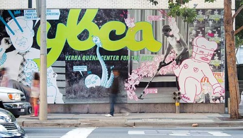
Yerba Buena Center for the Arts (YBCA) 2009 Summer Campaign
Volume Inc., San Francisco, California, 2009
Description
One of the words that came up to describe YBCA was “subversive,” and the design concept came from studies on how to express this trait visually. This dovetailed nicely with separating YBCA from its competitors whose promotion tended primarily toward the stately and reserved.
YBCA was also one of the first arts institutions of its stature to champion graffiti and street art. We thought it appropriate to commandeer this medium’s methodology and allow surreal illustrations to hijack banal stock images, delivering the message that art is indeed subversive but, even more importantly, approachable and fun at YBCA.
Juror Notes
Thought this cross-media program was fun. I’d stop to look!
The logo is unique and fresh and fun for an art museum/center.
Great integration across media platforms.
Bright, offbeat, fun, colorful, fresh.
I would love to see this work up around my town. Great details, slightly bent, smart copy, well executed. Yes, beautiful, creative, all.
Credits
- Design firm
- Volume Inc.
- Creative directors
- Adam Brodsley, Eric Heiman
- Designers
- Kim Cullen, Talin Wadsworth
- Illustrator
- Jasper Wong
- Copywriter
- Jon Wolanske
- Client
- Yerba Buena Center for the Arts (YBCA)


