Museum of Modern Art Identity
Pentagram Design, New York, New York, 2009
Description
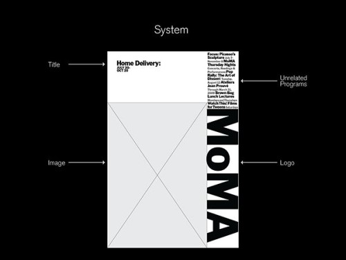
The Museum of Modern Art (MoMA) possesses one of the most recognizable logotypes of any cultural institution in the world. While the logo is iconic in itself, the museum needed a comprehensive institutional identity that would carry the spirit of MoMA across multiple platforms. The designers created a focused, organized and flexible identity system that supports program material in print, web and environmental applications. The system employs prominent use of the MoMA logo as a graphic device. An appropriate scale and careful cropping were developed to make the identity more powerful and cohesive, and to create an attitude that modernizes the institution’s image. A strong grid has been established for the uniform placement of elements. Images of artworks appear whole or are cropped for effect. The images are paired with the logotype, which has a consistent vertical placement similar to the signage on the museum’s facade.
Juror Notes
Great, bold, smart and simple system.
Great continuity and flexibility of brand system.
Credits
- Design firm
- Pentagram Design
- Art director
- Paula Scher
- Designers
- Julia Hoffmann, Lisa Kitschenberg, Paula Scher
- Client
- Museum of Modern Art


