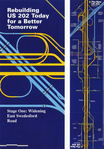
Rebuilding US 202
Joel Katz Design Associates, Philadelphia, Pennsylvania, 1996
Description
In our work for PennDOT, now in its thirteenth year, we strive to help drivers understand the impact of road construction and anticipate the routes they will need to take, as well as the decision points they will encounter. Knowing that users of road maps are interested not in every geographic detail but in knowing where to start, where to stop, and what the decision-point landmarks are along the way, we incorporated several nongeographic cartographic techniques in this map, including:
•Heads up: For this north-south road, the brochure is held one way for northbound traffic, the other way for southbound traffic, with the legends readable for either direction.
•Nongeographic vocabulary: A straight-line 90°/45° vocabulary is used to create a sense of logic and order and to make routes easier to follow.
•Variable scale: Distances are compressed in simple parts of the map and expanded in complex areas; an incremental scale on the size shows scale shifts between exits.
•Color coding: Color differentiations are made among three limited-access routes and other, surface routes. Gradations clearly show how exits inevitably lead from one road type to another.
Credits
- Design firm
- Joel Katz Design Associates
- Producer
- Joel Katz Design Associates
- Creative director/designer
- Joel Katz
- Copywriter
- Gene Blaum
- Typefaces
- Times, Univers
- Printer
- Baum Printing Co.
- Paper
- Westvaco Sterling Gloss 60# Text
- Client
- Pennsylvania Dept. of Transportation, District 6-0