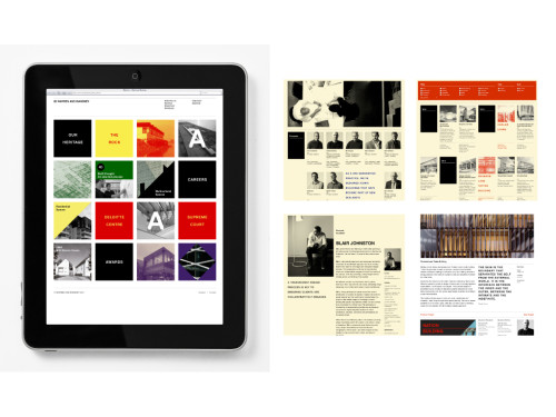
Warren and Mahoney
Alt Group, Auckland, Auckland, New Zealand, 2010
Description
Project brief: Warren and Mahoney is a third-generation architectural practice, producing iconic New Zealand buildings and generally seen as one of the instigators of architectural modernism in New Zealand. Warren and Mahoney sought to: 1) expand on existing partnerships and build projects within the Asia Pacific region; and 2) to change internal culture to allow a system to fuel the production of an online and offline marketing solution. Previously the website was built as a promotional site with Flash, providing little measurement and context to the diverse range of disciplines and work of Warren and Mahoney.
Approach: Architects’ websites generally suck: they exist as an architect’s monograph at a specific time. Often built in Flash, the sites treat the user as a viewer of the building rather than a participant. Architect practices can treat websites like a building: finished once it is published, never revisited until the site is redesigned. While this is perfectly appropriate for some experiences, an architecture firm’s site is a long list of projects that should be easily searchable and shareable. The site should give context to each project’s process and feature the team behind the building.
Effectiveness: The website has allowed Warren and Mahoney to respond to the recent Christchurch earthquake, allowing them to start communicating their vision for the Christchurch city center to be rebuilt. Website articles and featured projects were aligned with the PR campaign, earning coverage in all major New Zealand papers and television.
Page views to the website have increased by 550 percent and the site bounce rate dropped from 80 to 24 percent. With the structure of the new website and associating key staff with hero projects, Warren and Mahoney have spoken at two industry events covering workplace strategy (a new discipline offering). Internal engagement with an internal product blog and intranet has allowed publishing project sheets and competition boards to significantly decrease time needed to create profiles.
Warren and Mahoney have been featured on external websites through accessible content. Pictures and text are easily copied and attributed to the project, which results in increased mentions within the wider New Zealand and Australian blog community.
Juror Notes
Very clean. A lot of information, well organized. Great color and display. Ambient and subtle structure. Easy to update and keep fresh (most are static). Raises the bar in the category.
Design candy. Elegant and effective.
Credits
- Design firm
- Alt Group, Auckland
- Creative director
- Dean Poole
- Designers
- Nadia Aftimos, Tim Archer, Scott Arthur, Kris Lane
- Client
- Warren and Mahoney