Post-War Literature
The Stinehour Press, New York, New York, 1997
Description
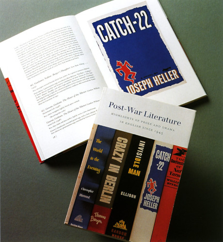
This was one of the most interesting projects I have worked on, from a format/conceptual point of view. Originally the customer wanted to print an 8.5 x 11 inch catalogue, with an illustration section at the end containing one color image (dust jacket) and one black-and-white (text or inscription page) image per page from each book illustrated. There were two problems with this: one was that to put two vertical images on an 8.5 x 11 page would mean that each image would be 4 x 5 inches or smaller, with lots of wasted space, and second, the cost of such a catalogue was beyond their budget. They still required color images, which is where a lot of the expense was going, so I came up with the following solution: we designed a much smaller catalogue (6 x 9) with inserted four-page sections, each containing a color image on the front and black-and-white inside. This way, we could reproduce the images at about 5 x 8 inches, much larger than two per page on the 8.5 x 11 format; the images would follow sequentially, as in a book; and it would be more economical since we could print the color on one side of a 4/1 sheet. As an added bonus, we fit a color dust jacket for this catalogue on the two sheets that had the color images. We also played off the gloss coated paper for the illustration inserts against an uncoated paper for the text, highlighting the reproductions. The typography was relatively straightforward and clean, using two different “cuts” of the elegant Walbaum typeface (the Berthold drawing, which is weightier and crisper, for display; and the Monotype drawing—based on the smaller sizes of the Walbaum originals—for text).
Credits
- Design firm
- The Stinehour Press
- Art director
- Jerry Kelly
- Graphic designer
- Jerry Kelly
- Authors
- Glenn Horowitz, Sara Funke
- Typeface
- Walbaum (Monotype and Berthold)
- Printer
- The Stinehour Press
- Paper
- Mohawk Superfine
- Publisher/client
- Glenn Horowitz Bookseller