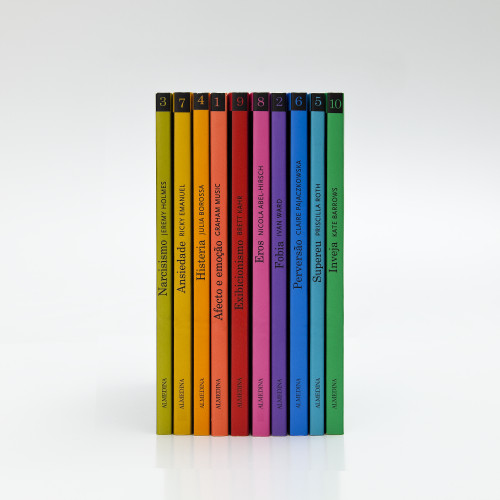
Themes of Psychoanalysis
FBA. - Ferrand, Bicker & Associados, Coimbra, Portugal, 2010
Description
Project brief: This is the Portuguese edition of a book series on psychoanalysis written for professionals but with the broader public in mind. The client requested a series of low-budget covers with graphic impact that would differentiate themselves from other books available on the subject. Although the design should differentiate these books from the self-help category, they intentionally look accessible for the majority of the audience, professional or non-professional.
Client quote: “The goal of this series was: books for impulse shopping with appeal to mental-health professionals as well as a broader audience with interest in these subjects.”
Approach: Each book in the series is dedicated to a specific subject and the cover reflects the subject matter by using simple typographic illustrations. The design is intentionally down-toned to set them apart from the “shouting covers” usually found in the self-help category. The books are small and we wanted them to seem accessible, include some wit in the illustrations and catch the eye. The covers communicate symbolically with letters but not necessarily with words, which is something we found quite amusing considering the psychoanalytic themes addressed.
Effectiveness: We consider the design successful because with few resources—one typeface and a two-color offset print; no photographs, varnish or cut-out effects—the result is still fun and playful. These books are aimed to sell as a series so the design was also developed to trigger a collector attitude.
Client quote: “The collection has a very high recognition rate among our target audience because of the size of the books, the colors and the clean and simple design. The public reaction has been positive and we notice that in the sales.”
This collection was designed in two stages: the first part (volumes 1 through 5) was designed in 2002; the second (volumes 6 through 10) was designed in 2010 after the initial success. We are sending the complete collection so the jury can see how the entire series works together.
Juror Notes
These work well formally regardless of content but once translated, the clever icons deftly enact each of the themes (e.g. an “eye” on a green background for “envy”). Further proof that great cover design doesn’t have to cost a lot of money.
Credits
- Design firm
- FBA. - Ferrand, Bicker & Associados
- Art director
- João Bicker
- Designer
- Ana Boavida
- Jacket designer
- Ana Boavida
- Editor
- Paula Valente
- Publisher
- Almedina
- Project manager
- Cristina Alves
- Trim size
- 4.7 x 7
- Pages
- 90 (average)
- Typeface
- Century Schoolbook
- Printer
- Gráfica de Coimbra
- Printing method
- Two-color offset, plastified
- Paper
- Trucard, 225 gsm
- Client
- Grupo Almedina


