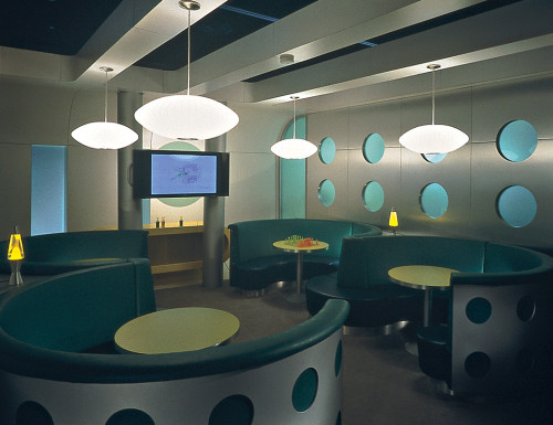
Sony Ericsson exhibit
Lorenc+Yoo Design, Roswell, Georgia, 2002
Description
The exhibit is a monument in the exhibition hall. It stands in stark white contrast to the visually hyperactive booths nearby. Its sinuous planes bend gracefully, spelling out the two capital letters of the newly formed company it represents.
Internally, it provides intimate spaces, as well as meeting, press and demonstration areas. Sony Ericsson products speak to the young adult, thus the interior finishes and displays were intended to appeal to this group through style, color and overall ambience. This powerful, futuristic brand space was overwhelmingly popular. It created an energetic atmosphere and has had rippling, global benefits in Sony Ericsson’s branding and product marketing.
Collections:
AIGA 365: 24 (2003)
Discipline:
Environmental graphic design
Format:
Exhibit
Credits
- Design firm
- Lorenc+Yoo Design
- Creative director
- Jan Lorenc
- Art director
- Chung Youl Yoo
- Designers
- Ken Boyd, Mark Malaer, Steve McCall, Susie Norris, David Park, Sakchai Rangsiyakorn
- Photographer
- Rion Rizzo (Creative Sources Photography, on site)
- Structural designer
- Searle Exhibit Technologies, Inc.
- Production director
- Beth Cochran (Journey Communications)
- Fabricator
- Geograph Industries, Inc.
- Client
- Sony Ericsson
Loading...
Loading...


