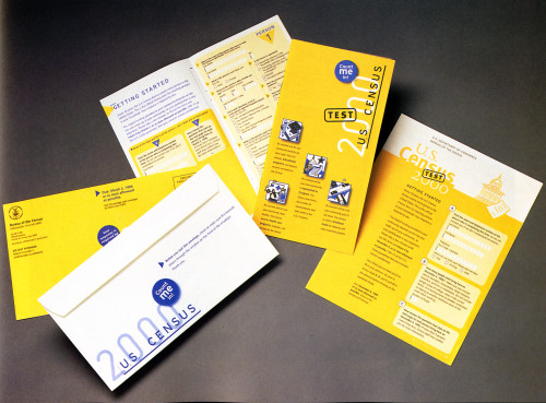
Census 2000
Two Twelve Associates, New York, New York, 1995
Description
The Census Bureau has long been concerned with low rates of return and the expenses associated with soliciting each decade’s responses. The designers reorganized, simplified, and redesigned the instructions so that the experience of receiving, completing, and returning the material would be as easy as possible. The form was reformatted to facilitate input by people instead of processing by machines. Primary, patriotic colors were chosen for their ability to stand out in the mail and look contemporary in the year 2000. A typeface was selected for its legibility and date recognition by optical scanning machines. Of the three similar designs submitted, the Census Bureau chose these two versions for further development.
Collections:
Information Graphics: Design of Understanding
Repository:
Denver Art Museum
Discipline:
Information design
Format:
Case study, Information graphic, Instructional tool
Credits
- Design firm
- Two Twelve Associates
- Creative director
- Sylvia Harris Woodard
- Art director
- Julie Marable
- Illustrator
- David Flaherty
- Designers
- Ellen Conant, Courtney Howell
- Typographers
- Ellen Conant, Courtney Howell
- Writers
- Sylvia Harris Woodard, Julie Marable
- Printer
- Rochester Institute of Technology
- Client
- U.S. Department of Commerce
Loading...
Loading...