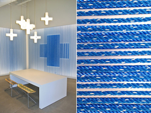
Blue Retail for Kansas City Blue Cross and Blue Shield
Willoughby Design, Kansas City, Missouri, 2013
Description
As the new Affordable Care Act was approaching, many health insurance companies were scrambling to reach members and non-members alike to meet the October 1, 2013 deadline. Blue Cross and Blue Shield of Kansas City (Blue KC) sought a solution to maintain its lead in the local market by introducing retail outlets throughout the area. They were positioned to provide one-on-one engagement throughout the metropolitan area but uncertain about the approach.
We were asked to help develop the retail experience with their architect, Helix Architecture. As a not-for-profit organization, Blue KC wanted the new retail concept to show their investment in making Kansas City a healthier community. The solution is a dynamic space that invites the community to learn about fitness and wellness as well as information about health insurance options. The goal was to increase brand awareness, not necessarily sell more plans. The client is pleased to find customers perceiving them now as a health company, not an insurance company.
Read the full case study with juror comments here: [http://www.aiga.org/case-study-blue-retail-kansas-city-blue-cross-blue-shield/]
Juror Notes
“This is a remarkable example of how context and focus can define (or redefine) a brand. Using the familiar and comfortable environment of a retail store, the designers helped customers relate to Blue Cross Blue Shield of Kansas City in a completely new way. By focusing on knowledge and resource sharing rather than sales, the organization gained the trust and esteem of existing and potential members. From an aesthetic standpoint, the experience feels contemporary and smart, with clear messaging and clever infusion of brand elements. It’s an out-of-the-box solution that works brilliantly from strategy to execution.” —Christopher Simmons
Credits
- Design firm
- Willoughby Design
- Client
- LiveBlue: Blue Cross and Blue Shield of Kansas City


