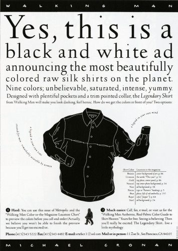
Walking Man Legendary Shirt Ad
Cronan Design, San Francisco, California, 1996
Description
The colors of the Legendary Shirt fabrics are amazing. We knew that a quarter-page full-color ad couldn’t convey their intensity. We had the idea of working with Metropolis magazine to put color into the black and white junior- page ad (at the price of the b/w ad) and get people to call for the swatch mailer.
We had two responses: 1) I loved the ad and I want the bronze shirt from page 26; 2) are you kidding? Just send me the swatches! Either response was fine with us.
This elegant solution demonstrates “thinking outside the box” and conveys the whole sense of Walking Man in one junior-size page.
Collections:
Communication Graphics: 18 (1997)
Repository:
Denver Art Museum
Discipline:
Promotional design and advertising
Format:
Advertisement, Illustration, Promotion
Credits
- Design firm
- Cronan Design
- Creative director
- Michael Cronan
- Graphic designer
- Anthony Yell
- Illustrator
- Clifford Jew
- Copywriter
- Mary Coe
- Client
- Cronan Artefact
Loading...
Loading...