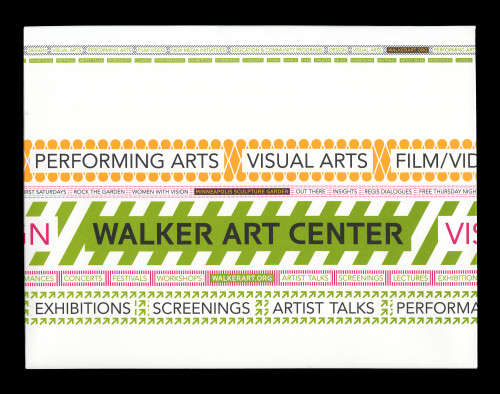
Walker Expanded
Walker Art Center, Minneapolis, Minnesota, 2005
Description
Walker Expanded is a new graphic identity for the Walker Art Center, which uses font-utility technologies to generate customizable lines of words and patterns. Unlike what occurs with a typical font, each key on the keyboard produces a word instead of a letter or character. Instead of differences like bold and italic, each font groups words into different vocabularies with language that is tailored to specific audiences. Other fonts in the series produce lines of patterns. In application, the words and patterns combine to create identity strips that can run either horizontally or vertically, and can be spare and simple, or ornamented and complex. Like a piece of tape, this strip of words and patterns can brand almost anything, from a business card to merchandise to a building.
Juror Notes
All applications are great.
Fresh, new; has its own voice.
Really feels like the Walker.
Love the originality.
The program is really strong, really holds together . . . “Olympic Magnitude.”
The system has a lot of depth.
The website is a bit of a letdown.
Credits
- Design firm
- Walker Art Center
- Creative director
- Andrew Blauvelt
- Art director
- Chad Kloepfer
- Designers
- Alex DeArmond, Eric Ishii Eckhardt, Chad Kloepfer, Scott Ponik, Matthew Rezac
- Production director
- Lisa Middag
- Interactive designers
- Eric Olson, Process Type Foundry
- Typefaces
- Avenir, Walker (custom), Walker Expanded (custom)
- Client
- Walker Art Center


