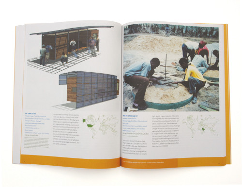
Design for the Other 90%
Tsang Seymour Design Inc., New York, New York, 2007
Description
“The Design for the Other 90% exhibition and book are intended to draw attention to a kind of design that is not particularly attractive, often limited in function, and extremely inexpensive.” —Barbara Bloemink, curator
Given the curatorial message and the nature of the content, our first formal gesture was to juxtapose the images and illustrations with a typography derived from the commodity graphic design associated with commercial strip malls and supermarket windows: a bold, bright, “look at me” aesthetic that is intended to attract attention but not signify status or luxury. This matter-of-fact design strategy subsequently drove the creation of the book’s other design elements, including the grid structure, typographic hierarchy and organization of the plate section. The photography, mostly shot in the field with consumer-level cameras, was left raw. The printing, on lightweight uncoated paper stock, references a temporal aesthetic that stands in contrast to the glossy “high-end” museum publication intended to lend prestige to the featured content.
Juror Notes
Can design effect change? This catalog-as-reference-book carefully and sustainably documents and diagrams a number of efforts.
Credits
- Design firm
- Tsang Seymour Design Inc.
- Creative directors
- Patrick Seymour, Catarina Tsang
- Art director
- Laura Howell
- Designer
- Laura Howell
- Jacket designer
- Laura Howell
- Author
- Cynthia E. Smith
- Editor
- Chul R. Kim
- Trim size
- 8.375 x 10.75 inches
- Pages
- 144
- Quantity printed
- 12,000
- Typeface
- Rhode
- Printer
- Oceanic Graphic Printing
- Jacket printer
- Oceanic Graphic Printing
- Papers
- Eco Japanese recycled matte-coated art board, 260 gsm (cover), ECO100 Japanese recycled uncoated stock, 81.4 gsm (text)
- Binding
- Limp bound, section sewn in 16 pages
- Publisher
- Cooper-Hewitt, National Design Museum


