Espace GO Branding
Cossette / Identica Branding & Design, Montreal, Quebec, 2009
Description
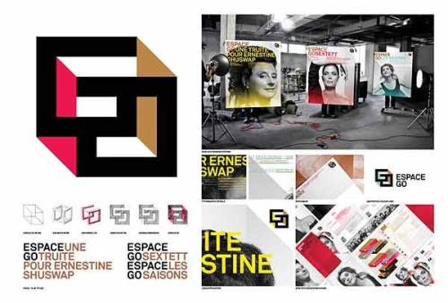
ESPACE GO is a feminist avant-garde theater, the only one in Montréal with a variable geometry room. To celebrate the 30th anniversary, the management wanted to rejuvenate its image. They changed the two round letters (GO) into square-shaped letters to better illustrate the stage/backstage reality and the ability to reinvent the boundaries of theater. Colors give a third dimension to the work.
The 2009–2010 posters reveal the richness of the new identity, giving all the attention to the actress’ roles while leveraging the identity’s many dimensions. Colors, shapes and typography boldly anchor the new identity in the Montréal theater scene.
Juror Notes
Great portraits. Well handled with nice color and clean type.
Smart and bold logo identity. Great use of copy lines and organization name in headlines. Bold, clean typography.
Credits
- Design firm
- Cossette / Identica Branding & Design
- Creative director
- Barbara Jacques
- Art director
- Olivier Caron
- Designers
- Olivier Caron, Caroline Gilbert
- Photographer
- Carl Lessard
- Production artists
- Nathalie Boucher, Daniel Cartier
- Client
- Théâtre ESPACE GO

