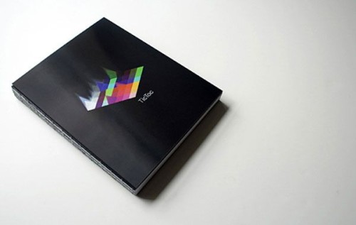
Tic Toc
The Map Office, New York, New York, 2009
Description
J. Walter Thompson (JWT) commissioned The Map Office to design its global advertising book TicToc. The book spans its global network of offices and showcases the best work from 2009. And, the book was intended to be for read by the company’s 10,000 employees and other advertising firms worldwide. The Map Offices’ brief was not only to render the work within a beautiful book form but to also demystify some of JWT’s internal workings. The Map Office set about developing visualization diagrams and devices showing the facts and figures of the JWT worldwide organization—from the dominant colors used in each of the chosen campaigns to what kinds of typefaces are used by different campaigns globally.
The notion of visualization takes center stage on the book’s cover. The lenticular cover represents the dynamic approach shown throughout the book, in which statistical values change over time. The book is bound using various colors of thread to represent JWT’s coporate color scheme. The overall physical form truly makes it stand out among the crowd.
Juror Notes
The charts, diagrams, color coding and icons are engaging and are presented with a modern edge that doesn’t feel like it’s trying too hard to be modern. The lenticular cover perfectly represents the statistical nature of the book while pleasantly evoking classic Peter Saville record covers.
Credits
- Design firm
- The Map Office
- Creative director
- Graham Wood
- Art director
- Eddie Opara
- Designers
- Brankica Kovrlija, Frank LaRocca, Salvador Orara