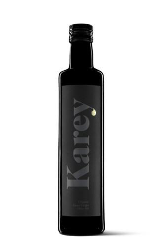
Karey Organic Extra Virgin Olive Oil
Moruba, Logroño, Spain, 2010
Description
Project brief: The client used to produce his oil and sell it in the surrounding area with no concern for brand image given the fact that sales were based on trust and friendship. The challenge was to increase production and to introduce the product into specialty shops and restaurants. The only thing that could not be changed was the Karey brand name.
Approach: The starting point was the sole condition that the brand name could not be changed. The challenge was to find the right typography for the brand, to apply the black-and-gold code as a sign of luxury and to include a drop of oil in the brand name as simply as possible. We aimed to create a label that would successfully attract customers in any market, an eye-catching design in which the brand name would play the key role. The standard shape made it possible to use the bottle as part of the product identification, given the fact that customers know that bottles of this type are used for oil. Therefore, much of the information that is normally put on the label could be eliminated.
The design was technically achieved with screen-printing ink and stamping. Once in the consumer’s hands, the bottle offers a deeper interpretation. The soft touch, in contrast to the glass, the large-scale typeface of the brand name, the stamping—all contribute to give the oil a guarantee of quality.
Effectiveness: It is true to say that the response from the distributors and gourmet shops has been a complete success. With a fine-quality product, exquisitely designed for a well-educated, demanding audience, this product perfectly meets the needs of these markets.
Juror Notes
An elegant, new-school take on an old-world European product.
Credits
- Design firm
- Moruba, Logroño, Spain
- Creative directors
- Javier Euba, Daniel Morales
- Designers
- Javier Euba, Daniel Morales
- Client
- Karey


