C
Alfred A. Knopf, New York, New York, 2010
Description
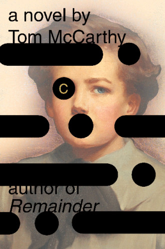
Project brief: A jacket for Tom McCarthy’s C.
Approach: I started to wonder, “So who, after all, is this Serge fellow,” aside from his character’s various meanings? (Serge Carrefax is the novel’s protagonist.) I found this incredible painting in the Russell-Cotes Art Gallery in Bournemouth of all places. It’s by Frank Brooks, a classic turn-of-the-century English school painter from Salisbury. His lifetime would have been roughly similar to Serge’s. And he made lots of portraits of Whitehall luminaries and World War I brass, which also seemed fitting. So here’s this boy with this haunted gaze. I printed him out low resolution and wrapped him around a book, then affixed these black plastic bands and dot things to it, and it just sat on my desk tormenting me for a while.
For what it’s worth, the circles and lines are supposed to be, on one level, Morse code. (As code, reading around from the back to the front of the jacket, they are not indecipherable but meaningless, except for the spine, which reads C). They also represent part of an important fever dream Serge has at the very end of the book where he imagines he and his bride wearing big, black typewriter ribbons around their heads and “handmaidens holding black circles aloft.” They are also, broadly speaking, some form of negation. They cancel out the human presence behind them and they conjoin with it as well. I also thought of player-piano rolls—the kind of Ampico rolls that those of Serge’s generation listened to. They are composed of dots and dashes also. Strangely enough, the user interface for most MIDI sequencers continues to use the same shapes.
Recently, Tom sent me an email: “I showed your cover to my friend Rod Dickinson and he said that it reminded him of how film was used as tape to store data in the early 20th century. German engineer Konrad Zuse had been building a computer in the living room of his parents’ apartment in Berlin. Zuse’s machine was the first working digital computer. One of his innovations was program control by punched tape. Zuse used discarded 35mm movie film and Turing punch cards.” In other words, make use of these patterns what you will. They are code and mechanical languages in general.
But back to our story. In terms of imagery and iconography, I was pleased thus far. I loved the way the character is hidden, peering out. The lad is kind of beset by these codes and in some weird way is transformed. The dots over his eye and the one that appears on but almost in his mouth have both an aspect of affliction (they are kind of pox-like) as well as an aspect of adornment (like an eye patch and a ball gag). It’s a weird image, I admit, but it represents Serge’s Slothropian relationship to technology pretty well, I think.
Then I thought about color. The original painting, as you can see above, was predominantly bluish and dark, which is nice, but there are strong color cues in the text that I wanted to honor. Serge is described as seeing the world through a predominantly brown veil. He is born, pupa-like, in a caul. There is a beautiful scene in the silk workroom at Versoie where the very young Serge looks at the world through a moth’s wing, turning everything a gauzy brown. Later, when he is a pilot during the war, he wears a pair of brown panty hose over his head. There are murky brown, sediment-filled waters, dark, inverted earthy skies, not to mention the whole closing section of the novel, which takes place on the Nile, where the world’s colors are “merged to brown.” There are constantly brown membranes and chrysalides between Serge and the world, and I wanted to use those color values. So I altered the painting so that it would look as it might if seen through a moth’s wing. (Also, on a more practical level, the more faded the image, the better the black stood out and the better the type read.)
Finally the type: I just set it as simply as possible. My first inclination was to place it inside the black bands but this detracted from the 2001 monolithic blackness of the dots and dashes (“none more black,” in the words of Nigel Tufnel). The information had to be big. This is one serious difference between a paperback original and a Knopf hardcover of a known quantity: the type has to be ginormous. Gild the title, spot-gloss the bands and circles and Bob’s yer uncle.
Effectiveness: The author told me I was his ideal reader. Because of this I will die happy.
Juror Notes
Gorgeous, mysterious introduction to the gorgeous, mysterious story within. Wonderful production.
Credits
- Design firm
- Alfred A. Knopf
- Designer
- Peter Mendelsund

