Wanderlust
Foreign Policy Design Group, Singapore, Singapore, Singapore, 2010
Description
Project brief: Wanderlust is a design boutique hotel by Singaporean hotelier Loh Lik Peng. This hotel, located in the colorful Little India area of Singapore, targets travelers who not only understand and appreciate design but also are curious and interested in discovering, engaging and immersing in new experiences. Each floor is designed by a different designer who was given free creative reign to design the rooms on that particular floor.
The project goal is to create a quirky and fun brand that is synonymous with the ideas and experience of travels and journeys, the process of discovery and that innocent dreamlike feeling. The vision of the hotel owner has always been grounded by the history and surroundings of his property. Since each floor is designed by a different designer, the floors all look and feel very different, even though the designs are pretty engaging. Our challenge is to achieve a cohesive voice and unity through the branding and identity—a voice that will augment the ideals and creativity of the project yet preserve the honest feeling of “wanderlust.”
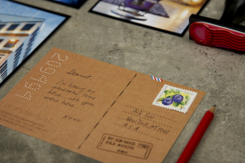
Approach: Little India has always been an eye-opener and cultural revelation to travelers, providing that wanderlust effect. We wanted to stay true to that experience by using contextual elements surrounding the area as well as from a traveler’s panorama. The building, a former elementary school in the early 1900s, inspired that childlike innocence: folding a paper plane or assembling a plane kit with the dream of one day traveling the world. Various forms of ephemera and keepsakes acquired during a journey were carefully studied, considered and deployed onto the collateral set. A bus ticket as rate cards; an air ticket as brochure; and a multifunctional itinerary book.
We also considered how the tactile quality of these materials would further evoke the wanderlust emotion—an added layered experience that we like the guests to take away, especially with the design of the itinerary. It looks like a simple innocent notebook but in actuality, it is a piece of multifunctional travel memorabilia that guests can use when experiencing Wanderlust in Singapore and take with them when they leave. Instead of the huge and almost-useless conventional in-room directory, the itinerary improves with added and almost commonsensical local information: area maps, train and bus maps, local shops and restaurants as well as thoughtful blank pages for notes and sketches. Guests are given an itinerary book, which gets visa-stamped upon checking in with room number and Wi-Fi passwords. We designed various visa stamps used by hotel staff to ink-stamp onto the itinerary depending on the activity: checking in, assignment of room number and Wi-Fi passwords, payments, expired stays, etc. The deployment of the itinerary has completely changed the way guests check in to the hotel and has positively elevated the Wanderlust experience.
Effectiveness: This project exceeded the client’s expectations on multiple levels. The hotel has garnered positive press online and offline, from the New York Times, Wallpaper* magazine, Travel & Leisure magazine and design magazines to design blogs, travel blogs and personal blogs like Luxe City Guides, Apartment Therapy, Fubiz, We Heart, Trendland, CNNGo, Time Out and more. At last count, the hotel had been featured on more than 500 blogs. Guests have blogged about their positive Wanderlust experience and have contributed good traffic to the website with an average of 25,000 visits monthly. Average time spent on the website is 8.7 minutes, which is considered high as most branded websites average closer to four or five minutes. The hotel is attracting the target demographics it has set out to lure and room rates have consistently been a whopping average of 75 percent, even full house on many occasions.
Also, the deployment of the itinerary has completely changed the way guests check in to the hotel and has positively elevated the Wanderlust experience. It improved the check-in workflow, converting a laborious and dreaded check-in process into something fun, a talking point. The sentiments are shared by guests and hotel reception staff.
The design of the hotel, its branding and identity materials such as the itinerary, rate cards and establishment cards, the check-in experience, the restaurant and the hotel environment—all have made Wanderlust Hotel the It place in Singapore. Wanderlust Hotel is also a recommended place to stay on the Singapore government-run tourism website YourSingapore.com.
“I am extremely happy about how Foreign Policy has helped translate our vision into something so quirky, happy and fun, hitting the nail right on the head. It’s a very honest portrayal of the vibe we are looking for in this hotel. We have gotten great press because of this. It’s a job very well done.” —Loh Lik Peng, owner of Wanderlust Hotel
Juror Notes
Plays on the act of traveling, instead of the usual “making you feel at home.”
Credits
- Design firm
- Foreign Policy Design Group, Singapore
- Creative director
- Yah-Leng Yu
- Art director
- Yah-Leng Yu
- Designer
- Yah-Leng Yu
- Printer
- Allegro Print
- Client
- Wanderlust Hotel


