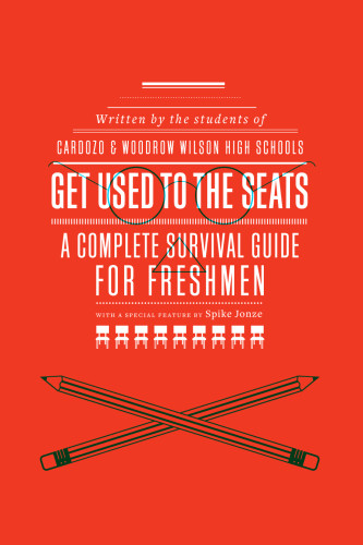
826DC: Get Used to the Seats
OMG, New York, New York, 2010
Description
Project brief: To create a cover that addresses the issues and tribulations of being a high school student, while maintaining a tie to the look of the overarching 826/McSweeney’s aesthetic.
Approach: I wanted to create a central image composed of the title and other imagery that would be stark and subversive in nature. The production budget was very minimal, which didn’t leave room for higher-end printing techniques.
Effectiveness: The cover has received a lot of attention and the sales have gone beyond the client’s expectations. In those respects, I think it has been a success.
Juror Notes
An inventive interpretation of the skull, with a cheeky twist that would appeal to the book’s target audience of high school freshmen.
Collections:
50 Books | 50 Covers of 2010
Repository:
Denver Art Museum
Discipline:
Book design
Format:
Book, Book cover
Credits
- Design firm
- OMG
- Designer
- Oliver Munday
Loading...
Loading...