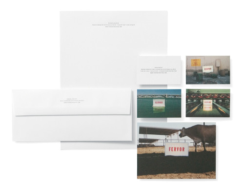
Fervor Creative Stationery
Fervor Creative, Inc., Scottsdale, Arizona, 2003
Description
After moving into our new office, we wanted to create name recognition and build a unique image. Our idea was to use our name photographed in odd and therefore memorable locations. The photography mimics our approach of simple and direct messaging and is devoid of a specific style, which speaks to our ability to adapt to different solutions effectively. The details were of equal importance. We used double-thick cards and letterpress printing on a high-cotton-content stock to create a tactile experience that complements the visual impact.
Juror Notes
It is so nice to see a well executed, well thought out, and well applied idea.
Collections:
AIGA 365: 25 (2004)
Discipline:
Brand and identity systems design
Format:
Logo, Stationery
Credits
- Design firm
- Fervor Creative, Inc.
- Creative directors
- Jami Pomponi Alire, Don Newlen
- Art directors
- Jami Pomponi Alire, Don Newlen
- Designer
- Paul Reed
- Printer
- Prisma Graphic
- Printing method
- Four-color process, Creo Trendsetter direct-to-plate system, letterpress
- Papers
- Mohawk Superfine Ultra White Eggshell 70 lb. text, 100 lb. cover, 110 lb. cover
- Typeface
- DIN Bold
- Client
- Fervor Creative, Inc.
Loading...
Loading...