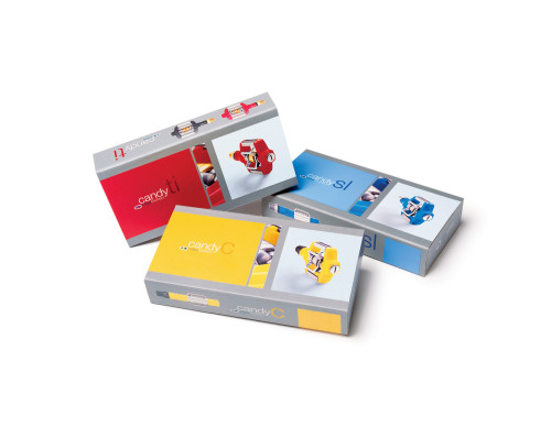
Crank Brothers “Candy” boxes
Igawa Design, Long Beach, California, 2003
Description
Creating a packaging system that reflected the personality and style of this new line of pedals required a little detour from the existing Crank Brothers’ brand. We thought it was important that the packaging convey the company’s philosophy as well as its innovative products, so we tailored the packaging system to fit a specific market segment. By using bold colors, minimal copy and stylized photography, we created a system that would be easily recognized by the consumer.
Juror Notes
Great execution; hip, technological and fun all at once—perfect for the audience. Screams quality, performance, fun, personality. It would have been easy to overdesign, but they didn't.
Collections:
AIGA 365: 25 (2004)
Discipline:
Package design
Format:
Package
Credits
- Design firm
- Igawa Design
- Creative director
- Sven Igawa
- Designer
- Sven Igawa
- Photographer
- Marc Tule
- Typeface
- Helvetica Neue
- Client
- Crank Brothers
Loading...
Loading...