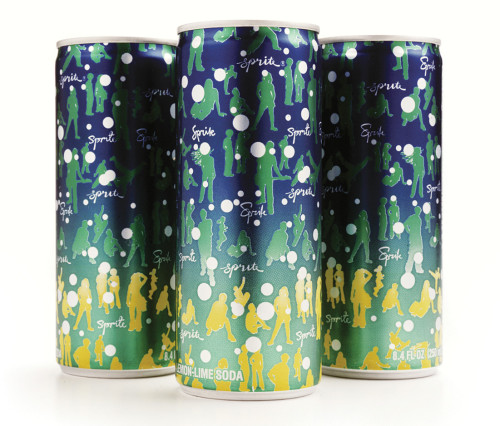
Sprite slim can
Ogilvy & Mather, New York, New York, 2003
Description
The Brand Integration Group (BIG), at Ogilvy & Mather believes that, to remain relevant, a brand must constantly evolve. That’s especially true for their client Sprite, a 44-year-old mega-brand with a strong youthful appeal and a deep connection to music and street culture. The designers’ goal was to support as well as challenge this brand—one of the most popular soft drinks in the world—so it could evolve in new, inventive ways.
Design can help us see an established brand in a new light, which is a critical advantage in a crowded, rapidly mutating marketplace. Working with the Coca-Cola Company, BIG developed a new global design system for Sprite that was deployed across many touch points, including this new can design for select clubs and special music events.
/“A brand must always be true to itself,” says Brian Collins, executive creative director of BIG. His creative team shunned the swirling, hyperbolic typography endemic to the category and helped Sprite embrace its unique history. More than a dozen years ago Sprite was the first mainstream brand to use hip-hop artists in advertising. Sprite also hired those groups to perform at free concerts in urban neighborhoods. Those goodwill gestures boosted the brand’s credibility with traditionally skeptical youthful consumers. That kind of forward-looking vision still resonates with young people today.
The same people who drink Sprite appear on the new slim can. BIG used their silhouettes to create a distinctive pattern. Showcasing young people in such a simple, graphic way—hanging out, enjoying friends—makes a compelling statement about Sprite’s unique personality.
The design system preserves Sprite’s visual equities and green/blue color palette even as it reconfigures them. No logo appears on the can. When these cans were distributed at music venues, they were an immediate hit. The strategy was to inspire underground market demand that could quickly trend up to inform broader, mass-audience communications. This solution proved to be so popular that this design soon informed the new look and feel of the brand’s core packaging and design. A collector’s item now, the original slim occasionally shows up on eBay for around $19.
Juror Notes
How the heck did they get this through? Branded without a big logo, it totally captures the spirit of the brand. The size elevates the brand experience. Groundbreaking for mass-consumer packaging.
Credits
- Design firm
- Ogilvy & Mather
- Creative director
- Brian Collins
- Art director
- Weston Bingham
- Designer
- Iwona Waluk
- Client
- The Coca-Cola Company