


The N Rebrand, Animations
MTV Networks, New York, New York, 2007
Description
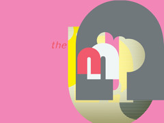
After seven years, The N refreshed its brand with a new identity reflecting an updated brand mission: to connect audiences to the electricity and possibilities inherent in being a teen. This identity is driven by a new brand logo and attendant system that centers on and reinforces the logo’s core components: circle forms suggesting growth and connection; an n letterform that is also inverted in a reference to “you,” the teen viewer, as the brand’s priority; and the capacity for these core shapes to act as both a window into teens’ experiences and a lens reflecting their points of view.
Aiming for diversity within a cohesive and easily identifiable system, we incorporated a variety of teen-inspired design elements within the coherent branded world. This gives the brand room to evolve within the defined parameters of its core identity, thus reflecting our viewers’ ever-changing identities.
Credits
- Design firm
- MTV Networks
- Creative director
- David Chustz (The N)
- Art director
- Catherine Chesters (The N)
- Designers
- Sandy Goijburg, Ming Junghuang, Andrew Riss, Kaori Sohma
- Writer
- Dixie Feldman
- Music
- Singing Serpent
- Producer
- Diana Horowitz
- Animators
- Kurt Hartman, Ming Junghuang, Andrew Riss, David Vanriper
- Client
- Randi Davis