

kate spade new york packaging program
kate spade new york, New York, New York, 2009
Description
There has been much growth and newness at kate spade new york within the last three years. The redesign of all our packaging was one of the first consumer-facing ways of signifying change.
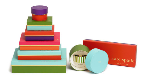
The concept for the package redesign was rooted in the brand’s love of color and a playful approach to classic design. We added five vibrant hues to our signature kate spade green and conceived the packaging program around our new brand palette. Every box shares a different pairing, no lid-base combination ever the same color. In turn, every box fits into a shopping bag that has a different unique color combination. Gold foil details, a crisp striped tissue and chocolate grosgrain ribbon are the elegant neutrals that balance out the large logo treatment and playful mix-and-match concept.
The kate spade new york girl is gracious. She is a spirited hostess and gift giver. Therefore we didn’t stop short at designing the details in this program. A simple gold dot stands out as a gift tag, the copy on the coordinating gift card reads “spend it all in one place.” Last but not least, a small message (“have courage”) is tucked into every shopping bag waiting to be discovered.
Juror Notes
Love the color and fabulous craftsmanship.
Who says you have to have a consistent color palette? This packaging makes you smile. And it’s impeccably printed. And it has hidden messages. I’m sold.
Credits
- Design firm
- kate spade new york
- Creative director
- Theresa Canning Zast
- Art director
- Yael Eisele
- Designer
- Dana Lucas
- Client
- kate spade new york