


SummerWorks 2010
Monnet Design, Toronto, Toronto, Ontario, 2010
Description
Project brief: To promote the festival and appeal to an 18–35-year-old demographic. To communicate the energy and relevance of the festival and to increase awareness and attendance.
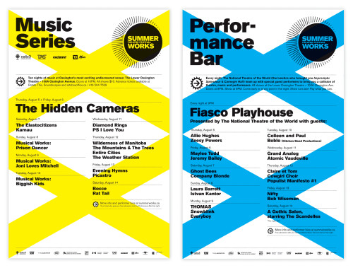
Approach: To celebrate the 20th edition of the SummerWorks Festival (Canada’s largest juried theater festival), we created a theme that follows the look we first established in 2008 with our festival rebrand. Every year a new theme is created, using neon colors and simple graphic illustrations. The 20th theme is integrated into the design—two Xs are featured on all posters and on the covers of the pocket guide and full program guide. In the spaces created by the X shapes, the theme of opposites is presented: tragedy and comedy (a new graphic twist on the theater masks so often seen) and night and day (conveying the diversity of the festival’s offerings as well as the fact that shows can be seen at most times of day and night).
Effectiveness: Since we joined the SummerWorks team as designers, overall attendance has nearly doubled, web hits have gone through the roof and merchandise has consistently sold out. There is a buzz about this festival now that was lacking before. For several weeks every summer, the areas around the festival venues are plastered with blinding neon posters and banners. They’re impossible not to notice. That’s what the festival is all about: being in your face and exciting! This campaign has been featured on innumerable design blogs and in several printed design annuals.
Juror Notes
Arresting. Memorable. Incites community engagement.
Credits
- Design firm
- Monnet Design, Toronto
- Creative directors
- Stéphane Monnet, Agnes Wong
- Designers
- Stéphane Monnet, Jayme Spinks
- Illustrator
- Stéphane Monnet
- Printer
- Incredible Printing, Printario
- Client
- SummerWorks Theatre Festival