


Americanana
C/C, New York, New York, New York, 2010
Description
Project brief: The title of this group exhibition, “Americanana,” playfully references the use of the past in the present, as diverse 20th-century American artists draw from traditional American crafts and folk art.
The Hunter College Art Galleries tasked us to produce an exhibition identity that brings this story to life in an inexpensive printed catalogue for students, the local community and an international arts audience. In exchange for working at a nonprofit rate, they offered us a leisurely three-month turnaround time.
Set against the current economic crisis and recent resurgence of interest in 19th-century style and crafts, the exhibition highlights the peculiarities of American creative heritage. In that spirit, it was critical that the catalogue be affordably produced while simultaneously embodying the show’s fundamental themes. Curator Katy Siegel was also emphatic that the catalogue exist as a worthwhile keepsake for the exhibition with original primary scholarship.
Approach: Our two creative directors worked together to immerse themselves in the project and to fully realize the spirit of the exhibition in the identity and catalogue. Cynthia Pratomo collaborated intimately with the curatorial team to learn everything about the featured artists and the historical traditions explored in the show, while Chen Chieh Ni researched parallel traditions in the graphic-arts tradition. We also considered what kind of primary-source material would make the catalogue useful for other scholars in the future, and proposed rare image reproductions and original interviews with the artists.
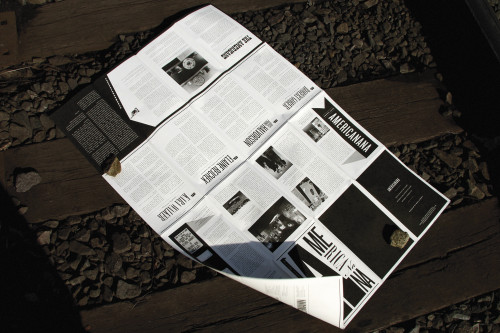
The show’s unique mash-up comes to life in the catalogue: our final design is inspired by 19th-century Americana and post-1960 American art, with references to Civil War broadsides, bold pop-art silk-screened posters and 1980s downtown DIY catalogs.
Printed on textured light-weight French butcher paper, the poster progresses from a dense black-and-white newspaper style to a full-color grid layout, evoking the progress and lineage between traditional and contemporary art.
Effectiveness: The design actually came in under budget, which allowed the gallery to distribute the catalogue for free—a first for Hunter. This was significant on many levels. First, a free catalogue obviously allowed more visitors the chance to engage meaningfully with the material. Second, it fulfilled the goal of openness and approachability that are at the heart of the gallery and this exhibition.
The exhibition received impressive traffic, to which the bold window display, invitations and catalogue contributed. Most importantly, the gallery team was extremely satisfied with the design’s ability to accurately capture the spirit of the show and to become not just the identity or catalogue but a real part of the exhibition.
Juror Notes
Folk art presented in a way that feels modern and relevant.
Credits
- Design firm
- C/C, New York
- Creative directors
- Chen Chieh Ni, Cynthia Pratomo
- Designer
- Emily Kowzan
- Client
- Hunter College Art Galleries