Andy Warhol: Motion Pictures
The Museum of Modern Art, New York, New York, New York, 2010
Description
Project brief: The project was to design an exhibition identity and website for Andy Warhol: Motion Pictures. Our goal for the website was to engage potential visitors through social media and give them a venue to participate in creating their own artwork based on Andy Warhol’s Screen Tests.
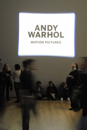
Approach: Warhol’s Screen Tests were 4:3 16mm film, which were transferred to DVD format. I designed the title-wall design and identity with this in mind, and used the same proportions and size of the artworks. The title-wall was produced by hand-painting the typography using scenic black paint (anti-reflective) on top of an extra-reflective white rectangle. This area was then precisely illuminated by a square spotlight that matched the overall form. The outcome was more precise, brighter and less expensive than what we could have achieved with a digital projection.
Effectiveness: The design was appropriate to the artwork, and it was well received by the exhibition curator, MoMA staff and general public.
An HD digital projector would have been very expensive to keep running every day, so we reused an existing lamp to project the spotlight. The final effect was brighter and crisper, while achieving the same conceptual effect. We invited anyone to create their own screen test, in any way they chose to respond. The only constraints were: the submissions would be made through a Flickr account; the video would be converted to black and white, and silent; and the duration would be shorter than 90 seconds. We recorded more than 57,000 page views during the exhibition, and more than 670 individual submissions.
Since the title-wall was hand-painted, we did not need to use toxic adhesives or unsustainable substrates. The exhibition allowed anyone in the world with computer access and a camera a chance to have their 15 minutes of fame.
Juror Notes
We like how the public was engaged and brought into the mind-set of the artist, and inside the gallery. The signage was a nice minimalist combination of media.
Credits
- Design firm
- The Museum of Modern Art, New York
- Creative director
- Julia Hoffmann
- Art director
- August Heffner
- Designer
- Samuel Sherman
- Curator
- Klaus Biesenbach
- Client
- The Museum of Modern Art