


All About Tea
Moving Brands, San Francisco, Portsmouth, United Kingdom, 2010
Description
Project brief: All About Tea is an expert wholesale tea distributor based in Portsmouth, United Kingdom. They source their tea from remote regions to bring the best of the world’s flavors to a global audience. Their offer extends from classic varieties to specialist blends. Their ambition was to hone their wholesale offer while satisfying the need to reach new audiences. They wanted to keep the warehouse feel but also establish a loyal consumer group that felt they were getting premium quality at wholesale prices.
Moving Brands was tasked with creating a new identity that would stand out in a “sea of sameness.” The identity needed to work effectively across their existing wholesale market and enable them to grow into retail channels. It was also vital to communicate the founder’s passion for the art and intricacies of tea.
Approach: Our assessment of All About Tea brought to light the company’s inherently metronomic delivery, the quality and rigor of their service and products, and their unparalleled passion for tea. We wanted to bring this story and way of operating to the forefront with their new identity.
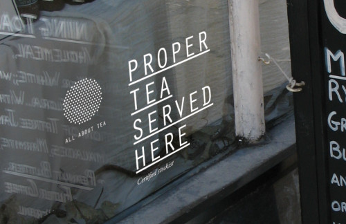
The mark represents the process of making tea; the blending and the straining. The shape of the mark references a seal or stamp—an iconic industry standard—and is used as a stamp of quality across the various applications. In all print applications, these dots are laser-cut, inspired by the factory elements and tools involved in the making and distribution of tea.
The type is Orator, a mono-spaced typeface. This reflects the uniform spacing of the mark and references the utilitarian information graphics associated with import and export. The typeface strengthens the ideas behind the metronomic process the company offers. The secondary type, Garamond italic, is used to represent the founder’s expert voice. This is more fluid, more conversational, and balances the strength of Orator. It also aims to bring out the quirks and passions of the All About Tea organization.
The color palette is black, white and silver. This monochromatic system again reflects the efficient approach of the new identity. This sets All About Tea apart from its competitors, in a landscape dominated by brown and green colors, tea leaves, and tree huggers.
The final All About Tea identity system incorporates a brand identity, brand architecture, guidelines, website, packaging, stationery, photography style, presentation and sales templates, mood film and tone of voice.
Effectiveness: A quotation like the one below from Andrew Gadsden, owner of All About Tea, describing the impact our work has had on his business, is what motivates and inspires the work of Moving Brands. We couldn’t have written it better ourselves:
“Since implementing the new identity we have literally not been able to keep up with the increased interest from new customers. The new website and packaging seems to have caught the imagination of a market tired of the same old design clichés in the tea sector. In the last month alone we have opened up a new market in France, Belgium and Scandinavia. We have solid interest from the United States and as soon as we are able to find a suitable distribution solution we will be able to capitalize on that.
“Branding is not the same as logo design. The process leading up to the actual design work was nothing short of a total redefinition of what the company is and what we do. The skill of the designers was in encapsulating this redefinition accurately in visual form. That explains why the branding feels so solid and correct. The graphical elements are in accordance with what we believe the company to be, and with other means of expression, such as how we write, how we speak on the phone, what we say about our products and, most importantly, how we think about our own company internally. This congruity of expression cannot be achieved without first doing the work of deciding what the company is. That is not a straightforward process, but the end result must be straightforward, or at least crystal clear, because it must be capable of being communicated in a split second through the skill of the designers.
“The process has been transformational for us. Moving Brands has brought a butterfly out of the chrysalis. We at All About Tea have invested many months of hard labor into building up the sales and operations of this young emerging tea company, but it is only now with the new identity that everything is falling into place and our dreams are becoming reality.
“Before Christmas it would have been impossible to imagine the level of quality new business that we are now handling. Famous London names are making unsolicited inquiries. We are receiving export distribution requests from new countries at the rate of three per week.
“Overall, we are very pleased with this outcome.”
Juror Notes
Clean, simple, modern interpretation (approach) of tea.
Credits
- Design firm
- Moving Brands, San Francisco
- Creative director
- Ben Wolstenholme
- Designer
- Marian Chiao
- Project manager
- Graves Englund
- Client
- All About Tea