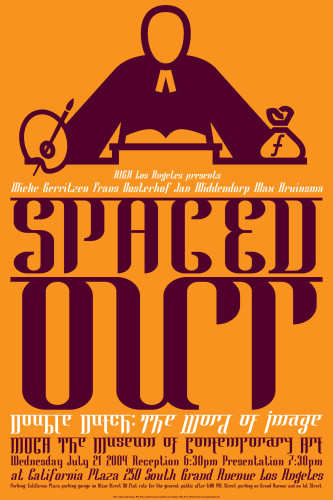
Spaced Out, Double Dutch: The Word of Image
Max Kisman, 2004
Description
Spaced Out is an event of AIGA San Francisco to promote and present different viewpoints on the visual language of typography and graphic design. Its aim is to attract a wide variety of professionals, students and those otherwise interested. Besides a promotional invitation/poster, a small book is published, called Double Dutch, containing background information in various articles, essays, visual commentary and a specially compiled typographic alphabet.
Although the articles and essays in Double Dutch have been previously published, they are still applicable to the state of current developments. They cover thoughts and opinions on metaphorical thinking in imagery, typographic developments in the Netherlands, historical relationships in Dutch and Californian graphic design, and positioning of graphic design in Dutch society and culture. Additionally, a number of American and Dutch graphic designers, illustrators and artists were invited to deliver a visual commentary on the concept of “double Dutch,” and 39 typeface designers were asked to contribute to the typographic alphabet Dutch Doubles.
In terms of visual-language concerns, the promotional products needed to express the essence of Dutch identity, whether in image or symbolic representations, such as the national colors. A contradiction in visual elements would emphasize the idea of metaphor or connotations of “double Dutch.”
In line with the philosophy, “Don’t design for designers,” the book’s graphic design had to be transparent and accessible, yet entertaining and slightly odd. A simple setup of images on the right and text on the left pages supplied a consistent page layout. Headlines were set in the specially designed Mata Hari typeface, slightly reminiscent of Asian scripts (hence referring to Dutch colonialism and to Mata Hari, a Dutch courtesan who was a double agent during World War I). Body text is set in Dolly Roman, a typeface designed by the Dutch graphic design studio Underware.
Credits
- Design firm
- Max Kisman
- Art director/creative director/designer
- Max Kisman
- Illustrator
- Max Kisman
- Production director
- Amos Klausner
- Picture editor
- Max Kisman
- Editor
- Max Kisman
- Writers
- Frans Oosyterhof, Jan Middendorp, Max Bruinsma, Max Kisman
- Copywriter
- Amos Klausner
- Printers
- Prepress, San Francisco (book); Color Graphics, San Francisco (posters)
- Printing method
- Digital (book); Offset (poster)
- Binders
- Prepress, San Francisco (book)
- Binding method
- Perfect bound
- Papers
- Spicers Paper Inc. (book), Utopia Appleton Coated (poster)
- Typefaces
- Mata Hari (headline and display), Dutch Doubles, a typographic alphabet, with contribution by 39 Dutch typeface designers, graphic designers and artists, Dolly Roman, Dolly Italic
- Client
- AIGA San Francisco chapter


